# Sidebar

A composable, themeable and customizable sidebar component.

Page: https://sui.draco.dev/docs/components/sidebar

### Example: sidebar-demo

```tsx
"use client";

import {
  Avatar,
  AvatarFallback,
  AvatarImage,
} from "@workspace/ui/components/avatar";
import {
  Collapsible,
  CollapsibleContent,
  CollapsibleTrigger,
} from "@workspace/ui/components/collapsible";
import {
  DropdownMenu,
  DropdownMenuContent,
  DropdownMenuGroup,
  DropdownMenuItem,
  DropdownMenuLabel,
  DropdownMenuSeparator,
  DropdownMenuShortcut,
  DropdownMenuTrigger,
} from "@workspace/ui/components/dropdown-menu";
import {
  Sidebar,
  SidebarContent,
  SidebarFooter,
  SidebarGroup,
  SidebarGroupLabel,
  SidebarHeader,
  SidebarInset,
  SidebarMenu,
  SidebarMenuAction,
  SidebarMenuButton,
  SidebarMenuItem,
  SidebarMenuSub,
  SidebarMenuSubButton,
  SidebarMenuSubItem,
  SidebarProvider,
  SidebarRail,
  SidebarTrigger,
  useSidebar,
} from "@workspace/ui/components/sidebar";
import {
  AudioWaveform,
  BadgeCheck,
  Bell,
  BookOpen,
  Bot,
  ChevronRight,
  ChevronsUpDown,
  Command,
  CreditCard,
  Folder,
  Forward,
  Frame,
  GalleryVerticalEnd,
  LogOut,
  Map as MapIcon,
  MoreHorizontal,
  PieChart,
  Plus,
  Settings2,
  Sparkles,
  SquareTerminal,
  Trash2,
} from "lucide-react";
import * as React from "react";

// This is sample data.
const data = {
  user: {
    name: "shadcn",
    email: "m@example.com",
    avatar: "/avatars/shadcn.jpg",
  },
  teams: [
    {
      name: "Acme Inc",
      logo: GalleryVerticalEnd,
      plan: "Enterprise",
    },
    {
      name: "Acme Corp.",
      logo: AudioWaveform,
      plan: "Startup",
    },
    {
      name: "Evil Corp.",
      logo: Command,
      plan: "Free",
    },
  ],
  navMain: [
    {
      title: "Playground",
      url: "#",
      icon: SquareTerminal,
      isActive: true,
      items: [
        {
          title: "History",
          url: "#",
        },
        {
          title: "Starred",
          url: "#",
        },
        {
          title: "Settings",
          url: "#",
        },
      ],
    },
    {
      title: "Models",
      url: "#",
      icon: Bot,
      items: [
        {
          title: "Genesis",
          url: "#",
        },
        {
          title: "Explorer",
          url: "#",
        },
        {
          title: "Quantum",
          url: "#",
        },
      ],
    },
    {
      title: "Documentation",
      url: "#",
      icon: BookOpen,
      items: [
        {
          title: "Introduction",
          url: "#",
        },
        {
          title: "Get Started",
          url: "#",
        },
        {
          title: "Tutorials",
          url: "#",
        },
        {
          title: "Changelog",
          url: "#",
        },
      ],
    },
    {
      title: "Settings",
      url: "#",
      icon: Settings2,
      items: [
        {
          title: "General",
          url: "#",
        },
        {
          title: "Team",
          url: "#",
        },
        {
          title: "Billing",
          url: "#",
        },
        {
          title: "Limits",
          url: "#",
        },
      ],
    },
  ],
  projects: [
    {
      name: "Design Engineering",
      url: "#",
      icon: Frame,
    },
    {
      name: "Sales & Marketing",
      url: "#",
      icon: PieChart,
    },
    {
      name: "Travel",
      url: "#",
      icon: MapIcon,
    },
  ],
};

function TeamSwitcher({
  teams,
}: {
  teams: {
    name: string;
    logo: React.ElementType;
    plan: string;
  }[];
}) {
  const { isMobile } = useSidebar();
  const [activeTeam, setActiveTeam] = React.useState(teams[0]);

  if (!activeTeam) {
    return null;
  }

  return (
    <SidebarMenu>
      <SidebarMenuItem>
        <DropdownMenu>
          <DropdownMenuTrigger
            render={
              <SidebarMenuButton
                size="lg"
                className="data-[state=open]:bg-sidebar-accent data-[state=open]:text-sidebar-accent-foreground"
              />
            }
          >
            <div className="flex aspect-square size-8 items-center justify-center rounded-lg bg-sidebar-primary text-sidebar-primary-foreground">
              <activeTeam.logo className="size-4" />
            </div>
            <div className="grid flex-1 text-left text-sm leading-tight">
              <span className="truncate font-medium">{activeTeam.name}</span>
              <span className="truncate text-xs">{activeTeam.plan}</span>
            </div>
            <ChevronsUpDown className="ml-auto" />
          </DropdownMenuTrigger>
          <DropdownMenuContent
            className="w-(--radix-dropdown-menu-trigger-width) min-w-56 rounded-lg"
            align="start"
            side={isMobile ? "bottom" : "right"}
            sideOffset={4}
          >
            <DropdownMenuGroup>
              <DropdownMenuLabel className="text-muted-foreground text-xs">
                Teams
              </DropdownMenuLabel>
              {teams.map((team, index) => (
                <DropdownMenuItem
                  key={team.name}
                  onClick={() => setActiveTeam(team)}
                  className="gap-2 p-2"
                >
                  <div className="flex size-6 items-center justify-center rounded-md border">
                    <team.logo className="size-3.5 shrink-0" />
                  </div>
                  {team.name}
                  <DropdownMenuShortcut>⌘{index + 1}</DropdownMenuShortcut>
                </DropdownMenuItem>
              ))}
            </DropdownMenuGroup>
            <DropdownMenuSeparator />
            <DropdownMenuGroup>
              <DropdownMenuItem className="gap-2 p-2">
                <div className="flex size-6 items-center justify-center rounded-md border bg-transparent">
                  <Plus className="size-4" />
                </div>
                <div className="font-medium text-muted-foreground">
                  Add team
                </div>
              </DropdownMenuItem>
            </DropdownMenuGroup>
          </DropdownMenuContent>
        </DropdownMenu>
      </SidebarMenuItem>
    </SidebarMenu>
  );
}

function NavMain({
  items,
}: {
  items: {
    title: string;
    url: string;
    icon?: React.ElementType;
    isActive?: boolean;
    items?: {
      title: string;
      url: string;
    }[];
  }[];
}) {
  return (
    <SidebarGroup>
      <SidebarGroupLabel>Platform</SidebarGroupLabel>
      <SidebarMenu>
        {items.map((item) => (
          <Collapsible
            key={item.title}
            defaultOpen={item.isActive}
            className="group/collapsible"
          >
            <SidebarMenuItem>
              <CollapsibleTrigger
                render={<SidebarMenuButton tooltip={item.title} />}
              >
                {item.icon && <item.icon />}
                <span>{item.title}</span>
                <ChevronRight className="ml-auto transition-transform duration-200 group-data-[state=open]/collapsible:rotate-90" />
              </CollapsibleTrigger>
              <CollapsibleContent>
                <SidebarMenuSub>
                  {item.items?.map((subItem) => (
                    <SidebarMenuSubItem key={subItem.title}>
                      <SidebarMenuSubButton render={<a href={subItem.url} />}>
                        <span>{subItem.title}</span>
                      </SidebarMenuSubButton>
                    </SidebarMenuSubItem>
                  ))}
                </SidebarMenuSub>
              </CollapsibleContent>
            </SidebarMenuItem>
          </Collapsible>
        ))}
      </SidebarMenu>
    </SidebarGroup>
  );
}

function NavProjects({
  projects,
}: {
  projects: {
    name: string;
    url: string;
    icon: React.ElementType;
  }[];
}) {
  const { isMobile } = useSidebar();

  return (
    <SidebarGroup className="group-data-[collapsible=icon]:hidden">
      <SidebarGroupLabel>Projects</SidebarGroupLabel>
      <SidebarMenu>
        {projects.map((item) => (
          <SidebarMenuItem key={item.name}>
            <SidebarMenuButton render={<a href={item.url} />}>
              <item.icon />
              <span>{item.name}</span>
            </SidebarMenuButton>
            <DropdownMenu>
              <DropdownMenuTrigger render={<SidebarMenuAction showOnHover />}>
                <MoreHorizontal />
                <span className="sr-only">More</span>
              </DropdownMenuTrigger>
              <DropdownMenuContent
                className="w-48 rounded-lg"
                side={isMobile ? "bottom" : "right"}
                align={isMobile ? "end" : "start"}
              >
                <DropdownMenuItem>
                  <Folder className="text-muted-foreground" />
                  <span>View Project</span>
                </DropdownMenuItem>
                <DropdownMenuItem>
                  <Forward className="text-muted-foreground" />
                  <span>Share Project</span>
                </DropdownMenuItem>
                <DropdownMenuSeparator />
                <DropdownMenuItem>
                  <Trash2 className="text-muted-foreground" />
                  <span>Delete Project</span>
                </DropdownMenuItem>
              </DropdownMenuContent>
            </DropdownMenu>
          </SidebarMenuItem>
        ))}
        <SidebarMenuItem>
          <SidebarMenuButton className="text-sidebar-foreground/70">
            <MoreHorizontal className="text-sidebar-foreground/70" />
            <span>More</span>
          </SidebarMenuButton>
        </SidebarMenuItem>
      </SidebarMenu>
    </SidebarGroup>
  );
}

function NavUser({
  user,
}: {
  user: {
    name: string;
    email: string;
    avatar: string;
  };
}) {
  const { isMobile } = useSidebar();

  return (
    <SidebarMenu>
      <SidebarMenuItem>
        <DropdownMenu>
          <DropdownMenuTrigger
            render={
              <SidebarMenuButton
                size="lg"
                className="data-[state=open]:bg-sidebar-accent data-[state=open]:text-sidebar-accent-foreground"
              />
            }
          >
            <Avatar className="h-8 w-8 rounded-lg">
              <AvatarImage src={user.avatar} alt={user.name} />
              <AvatarFallback className="rounded-lg">CN</AvatarFallback>
            </Avatar>
            <div className="grid flex-1 text-left text-sm leading-tight">
              <span className="truncate font-medium">{user.name}</span>
              <span className="truncate text-xs">{user.email}</span>
            </div>
            <ChevronsUpDown className="ml-auto size-4" />
          </DropdownMenuTrigger>
          <DropdownMenuContent
            className="w-(--radix-dropdown-menu-trigger-width) min-w-56 rounded-lg"
            side={isMobile ? "bottom" : "right"}
            align="end"
            sideOffset={4}
          >
            <DropdownMenuGroup>
              <DropdownMenuLabel className="p-0 font-normal">
                <div className="flex items-center gap-2 px-1 py-1.5 text-left text-sm">
                  <Avatar className="h-8 w-8 rounded-lg">
                    <AvatarImage src={user.avatar} alt={user.name} />
                    <AvatarFallback className="rounded-lg">CN</AvatarFallback>
                  </Avatar>
                  <div className="grid flex-1 text-left text-sm leading-tight">
                    <span className="truncate font-medium">{user.name}</span>
                    <span className="truncate text-xs">{user.email}</span>
                  </div>
                </div>
              </DropdownMenuLabel>
            </DropdownMenuGroup>
            <DropdownMenuSeparator />
            <DropdownMenuGroup>
              <DropdownMenuItem>
                <Sparkles />
                Upgrade to Pro
              </DropdownMenuItem>
            </DropdownMenuGroup>
            <DropdownMenuSeparator />
            <DropdownMenuGroup>
              <DropdownMenuItem>
                <BadgeCheck />
                Account
              </DropdownMenuItem>
              <DropdownMenuItem>
                <CreditCard />
                Billing
              </DropdownMenuItem>
              <DropdownMenuItem>
                <Bell />
                Notifications
              </DropdownMenuItem>
            </DropdownMenuGroup>
            <DropdownMenuSeparator />
            <DropdownMenuGroup>
              <DropdownMenuItem>
                <LogOut />
                Log out
              </DropdownMenuItem>
            </DropdownMenuGroup>
          </DropdownMenuContent>
        </DropdownMenu>
      </SidebarMenuItem>
    </SidebarMenu>
  );
}

function AppSidebar({ ...props }: React.ComponentProps<typeof Sidebar>) {
  return (
    <SidebarProvider className="relative isolate h-96 min-h-0 w-full overflow-hidden rounded-xl border">
      <Sidebar
        collapsible="icon"
        className="absolute! inset-y-0! h-full!"
        {...props}
      >
        <SidebarHeader>
          <TeamSwitcher teams={data.teams} />
        </SidebarHeader>
        <SidebarContent>
          <NavMain items={data.navMain} />
          <NavProjects projects={data.projects} />
        </SidebarContent>
        <SidebarFooter>
          <NavUser user={data.user} />
        </SidebarFooter>
        <SidebarRail />
      </Sidebar>
      <SidebarInset>
        <header className="flex h-16 shrink-0 items-center gap-2 transition-[width,height] ease-linear group-has-data-[collapsible=icon]/sidebar-wrapper:h-12">
          <div className="flex items-center gap-2 px-4">
            <SidebarTrigger className="-ml-1" />
          </div>
        </header>
      </SidebarInset>
    </SidebarProvider>
  );
}

export default function Preview() {
  return <AppSidebar />;
}
```


    A sidebar that collapses to icons.
  

Sidebars are one of the most complex components to build. They are central
to any application and often contain a lot of moving parts.

We now have a solid foundation to build on top of. Composable. Themeable.
Customizable.

[Browse the Blocks Library](https://ui.shadcn.com/blocks).

## Installation

```bash
bunx --bun shadcn@latest add @sui/sidebar
```

Install with the shadcn CLI or use the shared `@workspace/ui` package. Follow the [installation guide](/docs/installation) to configure the registry, load styles, and choose import aliases.

## Usage

```tsx showLineNumbers title="app/layout.tsx"
import { SidebarProvider, SidebarTrigger } from "@workspace/ui/components/sidebar"
import { AppSidebar } from "@/components/app-sidebar"

export default function Layout({ children }: { children: React.ReactNode }) {
  return (
    <SidebarProvider>
      <AppSidebar />
      <main>
        <SidebarTrigger />
        {children}
      </main>
    </SidebarProvider>
  )
}
```

```tsx showLineNumbers title="components/app-sidebar.tsx"
import {
  Sidebar,
  SidebarContent,
  SidebarFooter,
  SidebarGroup,
  SidebarHeader,
} from "@workspace/ui/components/sidebar"

export function AppSidebar() {
  return (
    <Sidebar>
      <SidebarHeader />
      <SidebarContent>
        <SidebarGroup />
        <SidebarGroup />
      </SidebarContent>
      <SidebarFooter />
    </Sidebar>
  )
}
```

## Composition

Use the following composition to build a `Sidebar` layout:

```text
SidebarProvider
├── Sidebar
│   ├── SidebarHeader
│   ├── SidebarContent
│   │   ├── SidebarGroup
│   │   │   ├── SidebarGroupLabel
│   │   │   ├── SidebarGroupAction
│   │   │   ├── SidebarGroupContent
│   │   │   └── SidebarMenu
│   │   │       ├── SidebarMenuItem
│   │   │       │   ├── SidebarMenuButton
│   │   │       │   ├── SidebarMenuAction
│   │   │       │   └── SidebarMenuBadge
│   │   │       └── SidebarMenuItem
│   │   │           ├── SidebarMenuButton
│   │   │           └── SidebarMenuSub
│   │   │               ├── SidebarMenuSubItem
│   │   │               └── SidebarMenuSubItem
│   │   └── SidebarGroup
│   │       └── SidebarMenu
│   │           ├── SidebarMenuItem
│   │           └── SidebarMenuItem
│   ├── SidebarFooter
│   └── SidebarRail
├── SidebarInset
└── SidebarTrigger
```

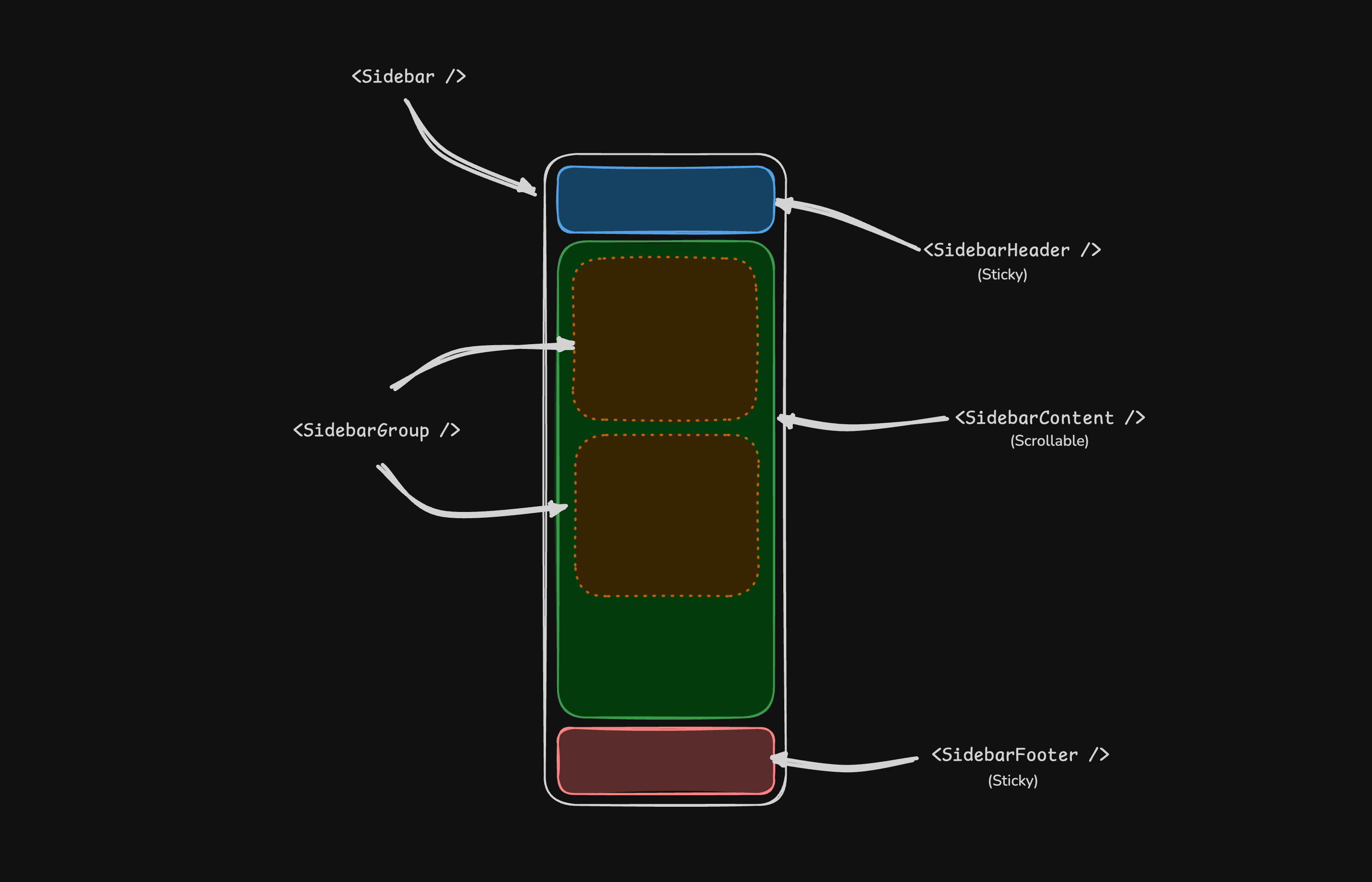
## Structure

- **SidebarProvider** — Handles collapsible state and provides sidebar context to child components.
- **Sidebar** — The main collapsible sidebar panel.
- **SidebarHeader** — Sticky at the top; use for branding, titles, or workspace switchers.
- **SidebarFooter** — Sticky at the bottom; use for user menus, settings, or actions.
- **SidebarContent** — Scrollable region between the header and footer.
- **SidebarGroup** — Groups related navigation with optional label, action, and content areas.
- **SidebarMenu** / **SidebarMenuItem** — Menu structure for links, badges, actions, and nested submenus.
- **SidebarRail** — Resize handle for adjusting sidebar width when applicable.
- **SidebarInset** — Wraps main content when using the `inset` variant.
- **SidebarTrigger** — Control that toggles the sidebar open or collapsed.
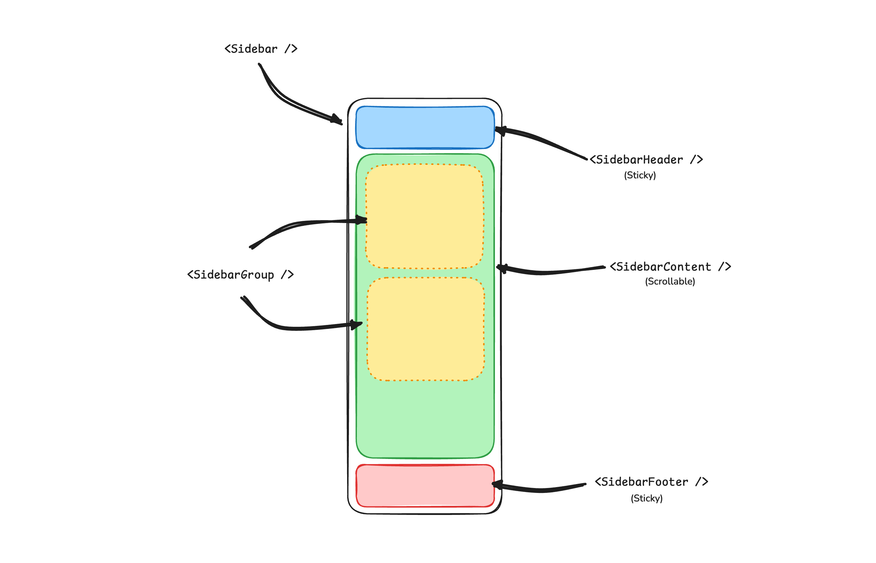
![Sidebar Structure](https://ui.shadcn.com/images/sidebar-structure.png)
![Sidebar Structure](https://ui.shadcn.com/images/sidebar-structure-dark.png)

## SidebarProvider

The `SidebarProvider` component is used to provide the sidebar context to the `Sidebar` component. You should always wrap your application in a `SidebarProvider` component.

### Props

| Name           | Type                      | Description                                  |
| -------------- | ------------------------- | -------------------------------------------- |
| `defaultOpen`  | `boolean`                 | Default open state of the sidebar.           |
| `open`         | `boolean`                 | Open state of the sidebar (controlled).      |
| `onOpenChange` | `(open: boolean) => void` | Sets open state of the sidebar (controlled). |

### Width

If you have a single sidebar in your application, you can use the `SIDEBAR_WIDTH` and `SIDEBAR_WIDTH_MOBILE` variables in `sidebar.tsx` to set the width of the sidebar.

```tsx showLineNumbers title="packages/ui/src/components/sidebar.tsx"
const SIDEBAR_WIDTH = "16rem"
const SIDEBAR_WIDTH_MOBILE = "18rem"
```

For multiple sidebars in your application, you can use the `--sidebar-width` and `--sidebar-width-mobile` CSS variables in the `style` prop.

```tsx showLineNumbers
<SidebarProvider
  style={
    {
      "--sidebar-width": "20rem",
      "--sidebar-width-mobile": "20rem",
    } as React.CSSProperties
  }
>
  <Sidebar />
</SidebarProvider>
```

### Keyboard Shortcut

To trigger the sidebar, you use the `cmd+b` keyboard shortcut on Mac and `ctrl+b` on Windows.

```tsx showLineNumbers title="packages/ui/src/components/sidebar.tsx"
const SIDEBAR_KEYBOARD_SHORTCUT = "b"
```

## Sidebar

The main `Sidebar` component used to render a collapsible sidebar.

### Props

| Property      | Type                              | Description                       |
| ------------- | --------------------------------- | --------------------------------- |
| `side`        | `left` or `right`                 | The side of the sidebar.          |
| `variant`     | `sidebar`, `floating`, or `inset` | The variant of the sidebar.       |
| `collapsible` | `offcanvas`, `icon`, or `none`    | Collapsible state of the sidebar. |

| Prop        | Description                                                  |
| ----------- | ------------------------------------------------------------ |
| `offcanvas` | A collapsible sidebar that slides in from the left or right. |
| `icon`      | A sidebar that collapses to icons.                           |
| `none`      | A non-collapsible sidebar.                                   |

  **Note:** If you use the `inset` variant, remember to wrap your main content
  in a `SidebarInset` component.

```tsx showLineNumbers
<SidebarProvider>
  <Sidebar variant="inset" />
  <SidebarInset>
    <main>{children}</main>
  </SidebarInset>
</SidebarProvider>
```

## useSidebar

The `useSidebar` hook is used to control the sidebar.

```tsx showLineNumbers
import { useSidebar } from "@workspace/ui/components/sidebar"

export function AppSidebar() {
  const {
    state,
    open,
    setOpen,
    openMobile,
    setOpenMobile,
    isMobile,
    toggleSidebar,
  } = useSidebar()
}
```

| Property        | Type                      | Description                                   |
| --------------- | ------------------------- | --------------------------------------------- |
| `state`         | `expanded` or `collapsed` | The current state of the sidebar.             |
| `open`          | `boolean`                 | Whether the sidebar is open.                  |
| `setOpen`       | `(open: boolean) => void` | Sets the open state of the sidebar.           |
| `openMobile`    | `boolean`                 | Whether the sidebar is open on mobile.        |
| `setOpenMobile` | `(open: boolean) => void` | Sets the open state of the sidebar on mobile. |
| `isMobile`      | `boolean`                 | Whether the sidebar is on mobile.             |
| `toggleSidebar` | `() => void`              | Toggles the sidebar. Desktop and mobile.      |

## SidebarHeader

Use the `SidebarHeader` component to add a sticky header to the sidebar.

```tsx showLineNumbers title="components/app-sidebar.tsx"
<Sidebar>
  <SidebarHeader>
    <SidebarMenu>
      <SidebarMenuItem>
        <DropdownMenu>
          <DropdownMenuTrigger render={<SidebarMenuButton />}>
            Select Workspace
            <ChevronDown className="ml-auto" />
          </DropdownMenuTrigger>
          <DropdownMenuContent>
            <DropdownMenuItem>
              <span>Acme Inc</span>
            </DropdownMenuItem>
          </DropdownMenuContent>
        </DropdownMenu>
      </SidebarMenuItem>
    </SidebarMenu>
  </SidebarHeader>
</Sidebar>
```

## SidebarFooter

Use the `SidebarFooter` component to add a sticky footer to the sidebar.

```tsx showLineNumbers
<Sidebar>
  <SidebarFooter>
    <SidebarMenu>
      <SidebarMenuItem>
        <SidebarMenuButton>
          <User2 /> Username
        </SidebarMenuButton>
      </SidebarMenuItem>
    </SidebarMenu>
  </SidebarFooter>
</Sidebar>
```

## SidebarContent

The `SidebarContent` component is used to wrap the content of the sidebar. This is where you add your `SidebarGroup` components. It is scrollable.

```tsx showLineNumbers
<Sidebar>
  <SidebarContent>
    <SidebarGroup />
    <SidebarGroup />
  </SidebarContent>
</Sidebar>
```

## SidebarGroup

Use the `SidebarGroup` component to create a section within the sidebar.

A `SidebarGroup` has a `SidebarGroupLabel`, a `SidebarGroupContent` and an optional `SidebarGroupAction`.

```tsx showLineNumbers
<SidebarGroup>
  <SidebarGroupLabel>Application</SidebarGroupLabel>
  <SidebarGroupAction>
    <Plus /> <span className="sr-only">Add Project</span>
  </SidebarGroupAction>
  <SidebarGroupContent></SidebarGroupContent>
</SidebarGroup>
```

To make a `SidebarGroup` collapsible, wrap it in a `Collapsible`.

```tsx showLineNumbers
<Collapsible defaultOpen className="group/collapsible">
  <SidebarGroup>
    <SidebarGroupLabel render={<CollapsibleTrigger />}>
      Help
      <ChevronDown className="ml-auto transition-transform group-data-open/collapsible:rotate-180" />
    </SidebarGroupLabel>
    <CollapsibleContent>
      <SidebarGroupContent />
    </CollapsibleContent>
  </SidebarGroup>
</Collapsible>
```

## SidebarMenu

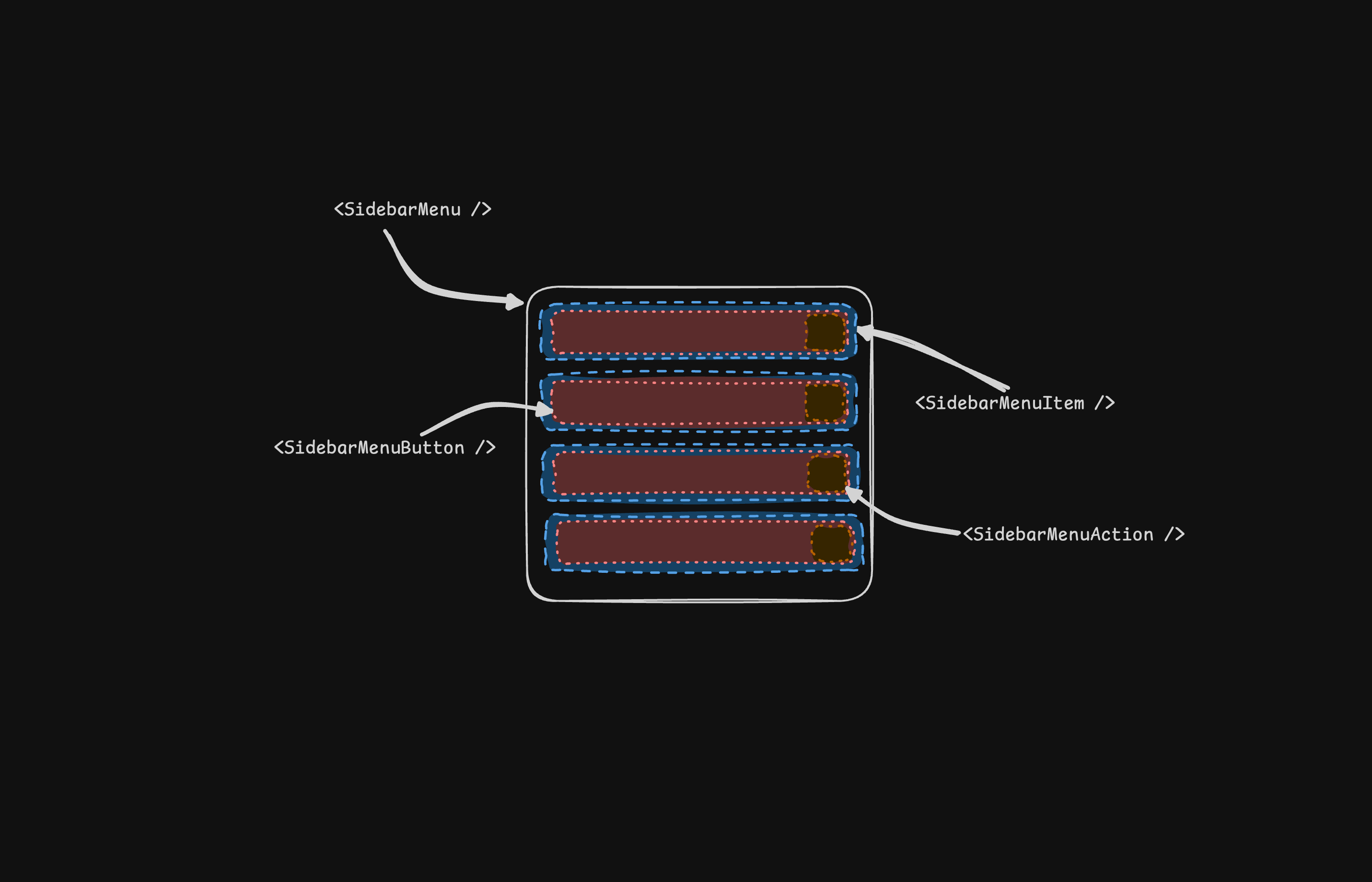
The `SidebarMenu` component is used for building a menu within a `SidebarGroup`.
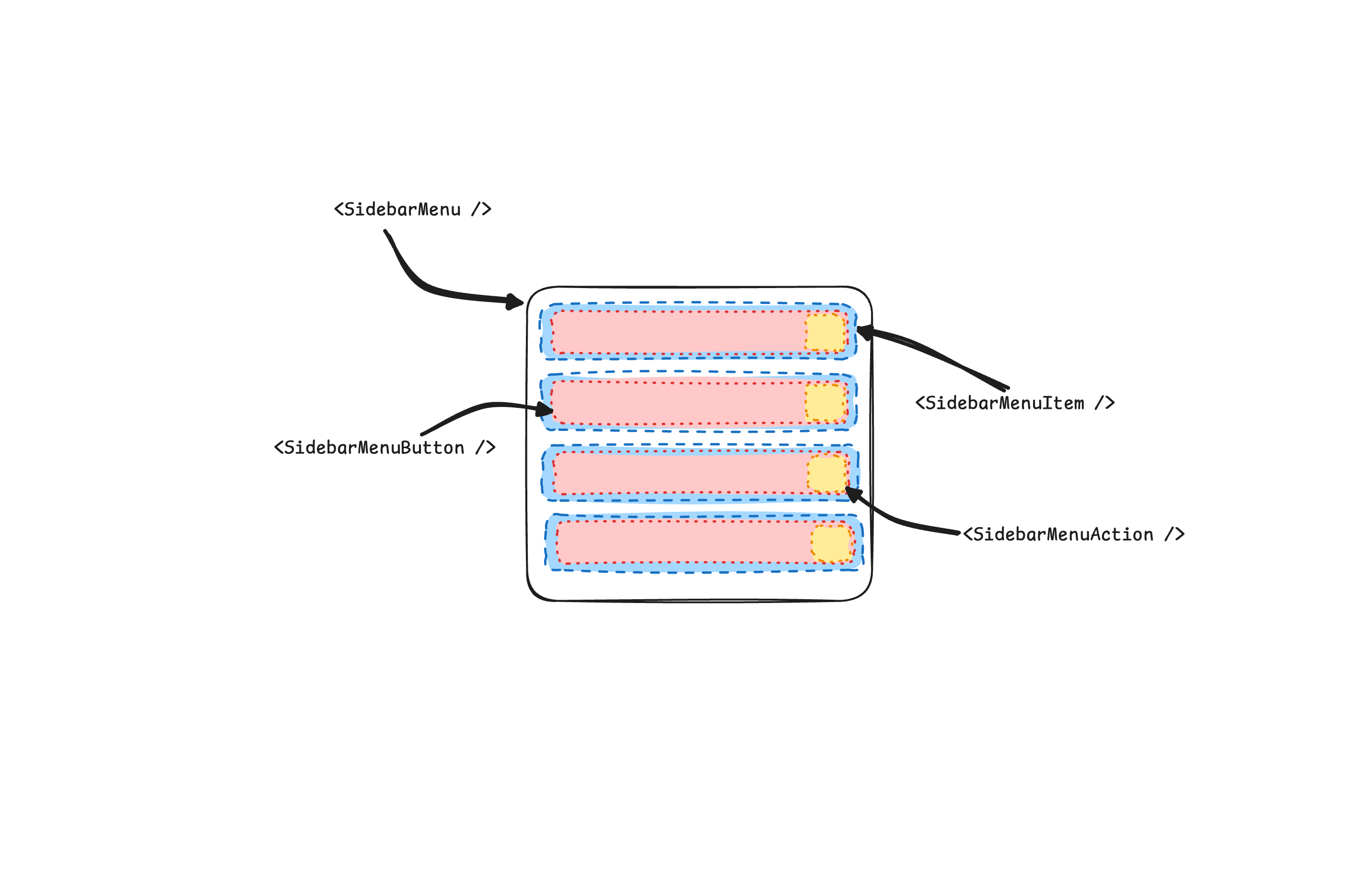
![Sidebar Menu](https://ui.shadcn.com/images/sidebar-menu.png)
![Sidebar Menu](https://ui.shadcn.com/images/sidebar-menu-dark.png)

```tsx showLineNumbers
<SidebarMenu>
  {projects.map((project) => (
    <SidebarMenuItem key={project.name}>
      <SidebarMenuButton render={<a href={project.url} />}>
        <project.icon />
        <span>{project.name}</span>
      </SidebarMenuButton>
    </SidebarMenuItem>
  ))}
</SidebarMenu>
```

## SidebarMenuButton

The `SidebarMenuButton` component is used to render a menu button within a `SidebarMenuItem`.

By default, the `SidebarMenuButton` renders a button but you can use the `render` prop to render a different component such as a `Link` or an `a` tag.

Use the `isActive` prop to mark a menu item as active.

```tsx showLineNumbers
<SidebarMenuButton render={<a href="#" />} isActive>
  Home
</SidebarMenuButton>
```

## SidebarMenuAction

The `SidebarMenuAction` component is used to render a menu action within a `SidebarMenuItem`.

```tsx showLineNumbers
<SidebarMenuItem>
  <SidebarMenuButton render={<a href="#" />}>
    <Home />
    <span>Home</span>
  </SidebarMenuButton>
  <SidebarMenuAction>
    <Plus /> <span className="sr-only">Add Project</span>
  </SidebarMenuAction>
</SidebarMenuItem>
```

## SidebarMenuSub

The `SidebarMenuSub` component is used to render a submenu within a `SidebarMenu`.

```tsx showLineNumbers
<SidebarMenuItem>
  <SidebarMenuButton />
  <SidebarMenuSub>
    <SidebarMenuSubItem>
      <SidebarMenuSubButton />
    </SidebarMenuSubItem>
  </SidebarMenuSub>
</SidebarMenuItem>
```

## SidebarMenuBadge

The `SidebarMenuBadge` component is used to render a badge within a `SidebarMenuItem`.

```tsx showLineNumbers
<SidebarMenuItem>
  <SidebarMenuButton />
  <SidebarMenuBadge>24</SidebarMenuBadge>
</SidebarMenuItem>
```

## SidebarMenuSkeleton

The `SidebarMenuSkeleton` component is used to render a skeleton for a `SidebarMenu`.

```tsx showLineNumbers
<SidebarMenu>
  {Array.from({ length: 5 }).map((_, index) => (
    <SidebarMenuItem key={index}>
      <SidebarMenuSkeleton />
    </SidebarMenuItem>
  ))}
</SidebarMenu>
```

## SidebarTrigger

Use the `SidebarTrigger` component to render a button that toggles the sidebar.

```tsx showLineNumbers
import { useSidebar } from "@workspace/ui/components/sidebar"

export function CustomTrigger() {
  const { toggleSidebar } = useSidebar()

  return <button onClick={toggleSidebar}>Toggle Sidebar</button>
}
```

## SidebarRail

The `SidebarRail` component is used to render a rail within a `Sidebar`. This rail can be used to toggle the sidebar.

```tsx showLineNumbers
<Sidebar>
  <SidebarHeader />
  <SidebarContent>
    <SidebarGroup />
  </SidebarContent>
  <SidebarFooter />
  <SidebarRail />
</Sidebar>
```

## Controlled Sidebar

Use the `open` and `onOpenChange` props to control the sidebar.

```tsx showLineNumbers
export function AppSidebar() {
  const [open, setOpen] = React.useState(false)

  return (
    <SidebarProvider open={open} onOpenChange={setOpen}>
      <Sidebar />
    </SidebarProvider>
  )
}
```

## Theming

We use the following CSS variables to theme the sidebar.

```css
@layer base {
  :root {
    --sidebar-background: 0 0% 98%;
    --sidebar-foreground: 240 5.3% 26.1%;
    --sidebar-primary: 240 5.9% 10%;
    --sidebar-primary-foreground: 0 0% 98%;
    --sidebar-accent: 240 4.8% 95.9%;
    --sidebar-accent-foreground: 240 5.9% 10%;
    --sidebar-border: 220 13% 91%;
    --sidebar-ring: 217.2 91.2% 59.8%;
  }

  .dark {
    --sidebar-background: 240 5.9% 10%;
    --sidebar-foreground: 240 4.8% 95.9%;
    --sidebar-primary: 0 0% 98%;
    --sidebar-primary-foreground: 240 5.9% 10%;
    --sidebar-accent: 240 3.7% 15.9%;
    --sidebar-accent-foreground: 240 4.8% 95.9%;
    --sidebar-border: 240 3.7% 15.9%;
    --sidebar-ring: 217.2 91.2% 59.8%;
  }
}
```

## Styling

Here are some tips for styling the sidebar based on different states.

```tsx
<Sidebar collapsible="icon">
  <SidebarContent>
    <SidebarGroup className="group-data-[collapsible=icon]:hidden" />
  </SidebarContent>
</Sidebar>
```

```tsx
<SidebarMenuItem>
  <SidebarMenuButton />
  <SidebarMenuAction className="peer-data-[active=true]/menu-button:opacity-100" />
</SidebarMenuItem>
```

## RTL

To enable RTL support in shadcn/ui, see the [RTL configuration guide](https://ui.shadcn.com/docs/rtl).

[View RTL Sidebar ↗](https://ui.shadcn.com/view/base-nova/sidebar-rtl)

## Changelog

### RTL Support

If you're upgrading from a previous version of the `Sidebar` component, you'll need to apply the following updates to add RTL support:

### Add `dir` prop to Sidebar component.

Add `dir` to the destructured props and pass it to `SheetContent` for mobile:

```diff
  function Sidebar({
    side = "left",
    variant = "sidebar",
    collapsible = "offcanvas",
    className,
    children,
+   dir,
    ...props
  }: React.ComponentProps<"div"> & {
    side?: "left" | "right"
    variant?: "sidebar" | "floating" | "inset"
    collapsible?: "offcanvas" | "icon" | "none"
  }) {
```

Then pass it to `SheetContent` in the mobile view:

```diff
  <Sheet open={openMobile} onOpenChange={setOpenMobile} {...props}>
    <SheetContent
+     dir={dir}
      data-sidebar="sidebar"
      data-slot="sidebar"
      data-mobile="true"
```

### Add `data-side` attribute to sidebar container.

Add `data-side={side}` to the sidebar container element:

```diff
  <div
    data-slot="sidebar-container"
+   data-side={side}
    className={cn(
```

### Update sidebar container positioning classes.

Replace JavaScript ternary conditional classes with CSS data attribute selectors:

```diff
  className={cn(
-   "fixed inset-y-0 z-10 hidden h-svh w-(--sidebar-width) transition-[left,right,width] duration-200 ease-linear md:flex",
-   side === "left"
-     ? "left-0 group-data-[collapsible=offcanvas]:left-[calc(var(--sidebar-width)*-1)]"
-     : "right-0 group-data-[collapsible=offcanvas]:right-[calc(var(--sidebar-width)*-1)]",
+   "fixed inset-y-0 z-10 hidden h-svh w-(--sidebar-width) transition-[left,right,width] duration-200 ease-linear md:flex data-[side=left]:left-0 data-[side=right]:right-0 data-[side=left]:group-data-[collapsible=offcanvas]:left-[calc(var(--sidebar-width)*-1)] data-[side=right]:group-data-[collapsible=offcanvas]:right-[calc(var(--sidebar-width)*-1)]",
```

### Update SidebarRail positioning classes.

Update the `SidebarRail` component to use physical positioning for the rail:

```diff
  className={cn(
-   "hover:after:bg-sidebar-border absolute inset-y-0 z-20 hidden w-4 -translate-x-1/2 transition-all ease-linear group-data-[side=left]:-end-4 group-data-[side=right]:start-0 after:absolute after:inset-y-0 after:start-1/2 after:w-[2px] sm:flex",
+   "hover:after:bg-sidebar-border absolute inset-y-0 z-20 hidden w-4 ltr:-translate-x-1/2 rtl:-translate-x-1/2 transition-all ease-linear group-data-[side=left]:-right-4 group-data-[side=right]:left-0 after:absolute after:inset-y-0 after:start-1/2 after:w-[2px] sm:flex",
```

### Add RTL flip to SidebarTrigger icon.

Add `className="rtl:rotate-180"` to the icon in `SidebarTrigger` to flip it in RTL mode:

```diff
  <Button ...>
-   <PanelLeftIcon />
+   <PanelLeftIcon className="rtl:rotate-180" />
    <span className="sr-only">Toggle Sidebar</span>
  </Button>
```

After applying these changes, you can use the `dir` prop to set the direction:

```tsx
<Sidebar dir="rtl" side="right">
  {/* ... */}
</Sidebar>
```

The sidebar will correctly position itself and handle interactions in both LTR and RTL layouts.